Sakina Muhamejanova,
Art Critic
During the years of independence the evolution of design in Uzbekistan was driven by the development of company logotypes, emblems, posters, catalogues, labels, packaging, window dressing and the like. The exploration of advertising domain occurs rather spontaneously in the country. The process involves both designers with professional education background, and people trained in design at different courses.
 During the years of independence the evolution of design in Uzbekistan was driven by the development of company logotypes, emblems, posters, catalogues, labels, packaging, window dressing and the like. The exploration of advertising domain occurs rather spontaneously in the country. The process involves both designers with professional education background, and people trained in design at different courses.
Advertisement design as part of promotion campaign creative strategy aims to develop means to visualize the image of the goods, which is achieved mostly with the help of graphic design (1, p. 211-214). Lead international design theorists believe that advertisement design is mostly focused on beauty that should draw attention to the object (2, p. 14). In advertisement design the category of beauty, expressed through the beauty of the idea, plays a defining role. This problem has been addressed in advertisement design in Uzbekistan.
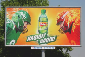
The conceptual idea primarily concerns with finding specific, original pictorial means of expression that facilitate a more effective consumer influence. One of the successful techniques is the use of metaphor and the brand logo. Take, for instance, the Ice soft drink outdoor ad, where the designer chose the image of two rivals, “drink” and “thirst”, whose duel catches the eye of the passers-by. Generally, all matches and competitions, in meaning and psychology, have an intrigue that draws our attention. The text in the picture that reads “The Real Match” suggests that the product stands against thirst. The green colour of the Ice drink gives a “cool” sensation, while red for the thirst emphasizes a fiery hot and aggressive status. The logo is simple and easy to understand (Figure 1).
 The beauty of form – the visual language of advertisement design – is volume, proportions, relation of light and shadow, voids and volumes, colours and scales, as well as material and technology employed to manufacture design object (3, p. 178). Through form, advertisement design reaches out to the target audiences.
The work of local designers exemplifying the importance of the beauty of form in advertisement is a billboard promoting the DOLCE ITALIA ice-cream and candy shop (Fig. 4.1 – 4.2). In rhythmic iteration it shows the product the shop offers. The beauty of form in this advertising message is achieved through the use of rhythm, perspective and colour; as a result, the viewer keeps his eyes on the billboard, driving his gaze to the centre. The perspective along the diagonal (Fig. 4.1) and the rhythm in a circle (Fig. 4.2) keep the viewer’s eye focused on the centre of the composition.
 Visual advertisement is the most effective among its other varieties (verbal, written, etc.), and its design represents one of the key elements in a promotion message, which help develop certain consumer attitude to the advertised product. In Uzbekistan, modern-day outdoor advertisement often employs original structures now frequently found on the streets of the capital city. These compositional solutions are very effective advertising appeals. They are made of interconnected objects positioned on different levels and dimensions to be viewed from different angles, and their expressivity depends on the point of view. These structures include both specimens of European brands, and the developments of local designers. An example of an ad by a well-known brand is a billboard promoting HEINZ tomato ketchup (Figure 5). The structure shows three-dimensional ketchup can “made” of tomato slices, delivering information on the product ingredients.
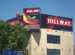
Quite interesting is a three-dimensional solution offered by local designers to advertise HILLWAY tea (Figure 5): it shows a huge one hundred gram package of Ceylon tea. Since the ad sits on the roof of a high-rise building located at one of the big central crossroads (near the Parkent market place) in Tashkent, it can be seen from all sides of the intersection. What makes this ad effective is the location and three-dimensional view. Statistics prove that people are more likely to remember the look of an item than its written description.
Thus, advertisement design is primarily associated with aesthetic form that not only carries the expressive capabilities of advertisement, but also, appealing to human spirit, helps develop aesthetic taste of the target audience. For example, the advertisements of the PODIUM ITALIA and GLAMOUR fashion boutiques regularly promote the fashion trend of the upcoming season; besides, the apparel ad sometimes provides the name of the fashion style trend (e.g. gilonga style).
Advertisement business cannot exist without a designer. Sadly, the role of advertisement designer often gets reduced to merely shaping other people’s ideas, and the “key quality of the profession has become an ability to use computer-aided graphics software” (4, p. 4). Digital revolution has had a two-sided effect on the development of advertisement design in the country. On the one hand, the expansion of computer-based technology has offered new possibilities to create visual products; on the other hand, it enabled virtually anyone skilled in graphic design software to join the “trendy” profession, without having even the basic knowledge in project engineering.
Advertising industry is not yet sufficiently developed in our country, lacking experts with sound practical experience. As a result, designers sometimes simply use ideas from other countries. For instance, a local Internet provider «EVO» ran a promo action called “Speed Plus”, and the local designers “developed” an image of a man’s head in a motorcycle helmet (Figure 6). A very similar design is known to appear earlier in Moscow in the advertisement of a BMW car (Figure 7): even the colours of red, white and deep-blue in these two ads are exactly the same.
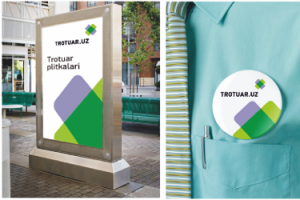
Analyzing the lapses and breakthroughs in advertisement design, one should mention the names of the country’s talented creative young designers who have already succeeded in this domain. One of them is Jamal Akbarov who has established his own brand in the industry. His products are competitive with those of foreign designers and highly valued in the manufacturing sector. One example is his personally designed logo of the trotuar.uz company, one of the largest producers of paving stone, curbs and ornamented paving tile in the country. The trotuar.uz logo features a stylized form of the tiles laid out in the shape of a heart to symbolically say, “made with love” (Fig. 8). A logo for the Strong Strike, the British American Tobacco distributor in Uzbekistan, was also created by Akbarov. In the Strong Strike logo the image shows a stylized elephant, the symbol of power, reliability and strength; it attracts good luck, and embodies strength and wisdom. The apt logo, as basis of the brand and the company’s face, will appear on all promotional merchandise for the brand (Fig. 9).
Designer’s work on the promotion message is directly linked to an important creative objective: to find and develop an art form as a method of exposing and expressing the idea and meaning of the message. The more interesting the art in an advertisement, the more persuasive it will be for the consumer. Creative approach to advertisement design, and understanding the nature of a metaphorical expression, artistic perspective and the principles of visualization in graphic design, along with an illustrator’s skill, enable the designer to fully realize his own creative potential.
An ability to find and assess new advertisement ideas develops in the process of studying not only specialist disciplines, but also design-oriented ones. It appears relevant to make training in the basics of design part of the current system of specialist training for the advertising industry (5, p. 25).
References
1. Разработка и технологии производства рекламного продукта. М., 2008.
